Latest Economic Charts
posted on
Nov 07, 2009 10:01AM

Golden Minerals is a junior silver producer with a strong growth profile, listed on both the NYSE Amex and TSX.

Nathan Martin always puts forth a good collection of economic charts. As noted below, we see that the worst case scenario in the previous bankster stress tests never anticipated unemployment to exceed 10%. Oops what to do now? Perhaps they should roll out Ben Bernanke again to see if he can maintain his perfect prediction record of wrong calls, i.e. subprime contained...green shoots!!! But not to worry though as they will still quote his every fraudulent word and allow the rhetoric to move markets.
Weekend reading - VHF
-
November Monetary Trends, and other charts of note
Nathan Martin
November 6, 2009
In this week’s update of Monetary Trends there are a couple of changes worth noting.
When looking at the money aggregates in terms of yoy percent change, we now see that M1, M2, and the larger MZM are all three pointed down. The change is that in this update we see M1 turned down sharply although still deep in positive territory.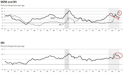
Our country is on such a fructose sugar high that attempting to stop the intake now will surely result in a raging migraine.
The velocity chart has now produced a positive upslope for the first time since this bear market began. I believe that this is the result of the formula that calculates velocity… as money floods the system, the math requires velocity to decrease and as it begins to recede the opposite occurs. This is going to be very interesting to watch going forward: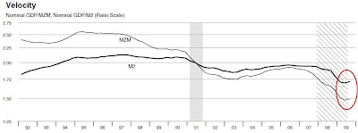
Price to Earnings ratio for the S&P 500 was in a small decline, but has actually increased slightly through this 11/4/2009 revision date. There are those who argue that we shouldn’t be looking at this chart (just close your eyes)… they argue that the bank’s large write-offs and write-downs are to blame and that with mark to fantasy we’ll see these “rearward looking” P/E ratios decline precipitously. My response? Bull. The banks are completely insolvent and if they marked their assets to anything close to reality the entire market would be deeply underwater and this P/E would be rightfully infinite. You can argue against history if you like, and come up with your own forecast for future earning based upon whatever fantasy you like, but you cannot talk away this classic historical indicator of market value: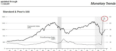
Someone on TF posted a chart with a little more P/E history, this chart goes all the way back to 1937. The current P/E is more than twice as high as the Nasdaq bubble in 1999:
Consumer credit came out this afternoon for the month of September. We got yet another net decrease, this time it was a drop of $14.8 billion, the consensus was for a drop of $10 billion (only a 48% miss). Here’s Econoday’s chart, the Fed has yet to update theirs: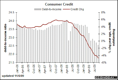
When the “Recovery Plan” was being sold, the public was presented a chart of what the Unemployment rate would look like with and without the plan being implemented. Of course it was implemented, and here’s how the “rate” (hello, try 17.5% in reality) is stacking up: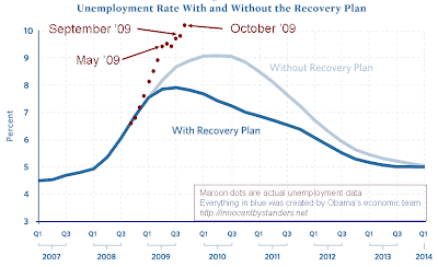
Chart from www.innocentbystanders.com
Boy, it sure is a good thing we got that recovery plan going and gave away all those trillions!
When the phony baloney bank stress tests were run, they were run under a “baseline” and a “more adverse” set of conditions. Below is a chart showing that reality is proving worse than their worst case conditions:
Chart from www.calculatedriskblog.com
Of course when the results of this phony test were announced, it was stated that the banks would likely not survive an unemployment rate greater than 10 (foreclosures track unemployment almost perfectly). Sure they can, just change the way they do their accounting, close your eyes, plug your ears, and hold your nose while shutting off your brain. What problem? Buy stocks! Hey, it’s not like we’re talking ‘bout something important, like love…