
GDX (Majors) Versus GDXJ (Juniors) Ratio Chart, Apr 17 2011 By: Dan Norcini
posted on
Apr 18, 2011 01:08PM

Golden Minerals is a junior silver producer with a strong growth profile, listed on both the NYSE Amex and TSX.

Posted: Apr 17 2011 By: Dan Norcini Post Edited: April 17, 2011 at 11:18 pm
Filed under: Trader Dan Norcini
For further market analysis and commentary, please see Trader Dan’s website at www.traderdan.net
Dear CIGAs,
At the suggestion of my good friend Jim Sinclair, I have prepared a chart detailing the ratio of the price of GDX compared to the price of GDXJ.
The GDX does contain some smaller cap miners but it also mainly includes the large cap mining outfits.
The GDXJ on the other hand, is comprised entirely of medium cap and small cap miners.
Over 60% of the stocks that make up the GDXJ are Canadian firms. Nearly 14% are US headquartered with 13.31% being Australian. The remaining are from various countries around the globe.
While not a perfect representation, it is a useful tool for charting the underperformance ( in general) of the small and medium cap miners compared to the larger cap miners.
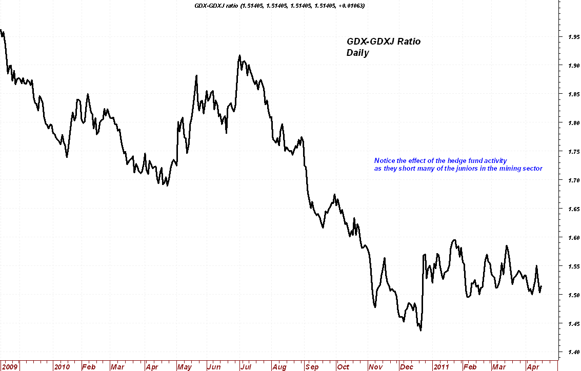
Note the steep decline in the line that began in the summer of last year which lasted throughout the remainder of 2010. Only towards the end of last year did the juniors recover a bit of ground but the best they could do was to retrace a small portion of their losses against the large cap miners by moving higher but since January they have gone nowhere against the large caps.
It seems to me that the hedge funds are selectively targeting some of the small and mid tier mining firms to go after with their short side of the spread trade that they have been employing. Perhaps they feel that due to their sheer size and financial firepower, they can overwhelm any buying coming into the smaller firms and thus create an effective put option against their long metals positions. I am not sure but either way, the chart reveals the reason for the frustration among many who own quality junior and mid cap mining firms whose share prices seem stuck in the mud even as the gold and silver markets continue soaring higher.
Let me take this opportunity to also clarify something in my earlier post about the HUI and XAU ratio charts. I did not mean to imply that the mining shares are trading at the same level as they were back in 2001 when silver was $4.00. That is of course preposterous as most have had strong gains over the last decade. The ratio charts’ purpose is to show whether the shares are underperforming or outperforming physical gold and/or silver. What the charts do show however is that the mining shares in general have so seriously underperformed the gains in both gold and silver, that the ratio of the indices to the underlying metals is ridiculously skewed. In the case of silver, you have to go all the way back to 2001, a period in which very few people were calling for a major bull run in the metal. There was little if any excitement whatsoever in the mining sector back then.
In regards to silver in particular, the ratio of the HUI and the XAU to it may not be as good of a gauge of how the silver stocks in particular are performing when compared to the price of the bullion, mainly because both indices are dominated by gold producers, particularly the HUI, but both indices do hold silver miners in their basket as well as some gold miners who produce both gold and silver. Since silver has been outperforming gold on a percentage basis, and both of these indices favor a larger number of gold producers than silver, it is reasonable to assume that both of the indices would be lagging silver when a ratio is constructed, but not to this extent. To see these indices trading at such extremely low levels when a ratio is created is indicative of the kind of short selling pressure that is active in the mining sector in many instances.
It is just mindboggling to see how undervalued many of the shares are when compared to the metals. While many have moved strongly higher, a large number of them continue to lag and are not reflecting the kind of price movements that we would expect to normally see with the bullion making either all time highs in price or 30+ year highs.
If you want to get a "fair" or reasonable level at which the indices should be trading, run some statistical analysis and see what the mean or average value should be then see what the standard deviation away from that mean is. I will leave that to my statistics friends but either way, the result is indicative of how cheap the stocks are compared to the metals in many cases.
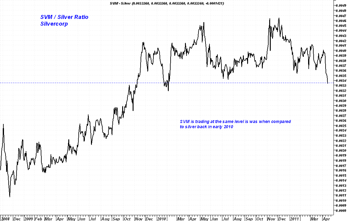
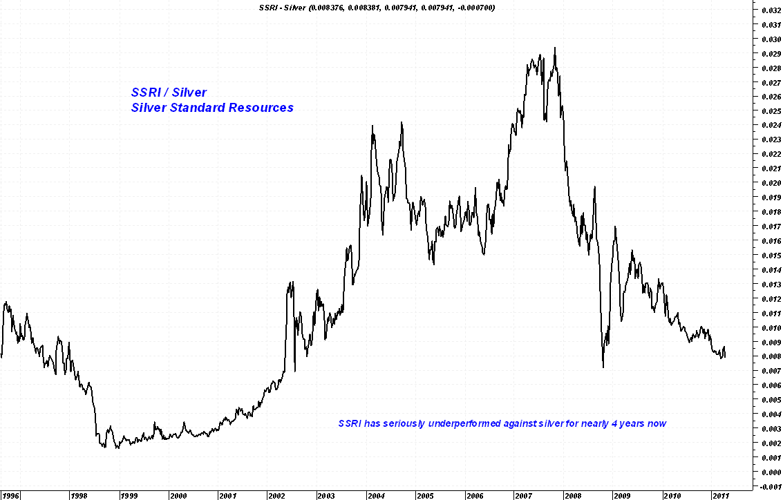
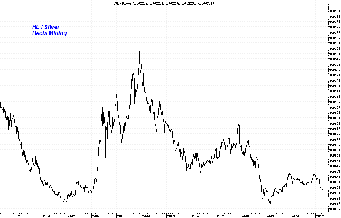
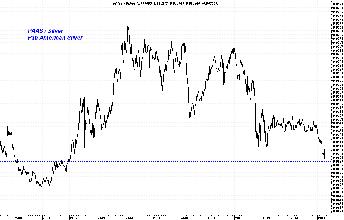
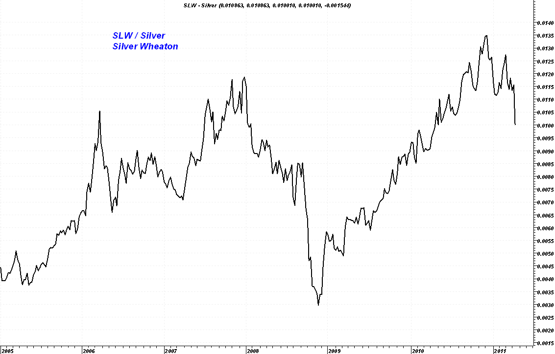
Here are a few of the silver stocks comparing them to the price of silver and creating a ratio chart. A rising line indicates the stock price is outperforming the price of silver. A falling line indicates the stock is underperforming.
A pleasant exception: SLW
ShareThis