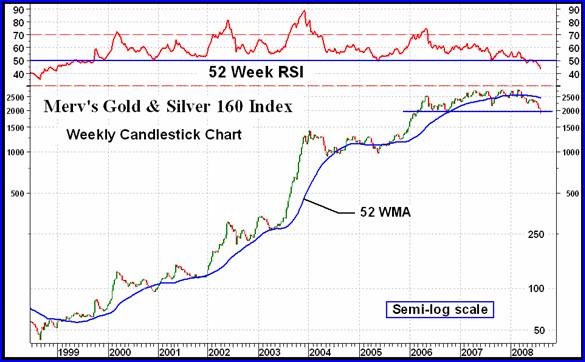
MERV's Index (Pooched from FROBE on the MAG board on the 'other' site)
posted on
Aug 15, 2008 10:52AM

San Gold Corporation - one of Canada's most exciting new exploration companies and gold producers.

With the FED being in their destruction phase of all things (real estate, oil, commodities, etc.), it seemed highly unlikely the golden door exit would be left wide open. When they appear weakest is the time to be on high alert.
The Merv Index is put together by an Aerospace Engineer (at night when he gets out his cape). Read his commentary carefully as it looks like more pain and agony is in store.
Things look pretty bleak at the moment.
PRECIOUS METALS STOCKS

Most investors in precious metal stocks (gold & silver) basically look at the PHLX Gold & Silver Sector Index or the AMEX Gold BUGS Index to understand what's going on in the precious metals market. But these Indices reflect the actions of only a select short list of stocks and more importantly they reflect the actions of the higher weighted stocks in their Indices. Many of their smaller Index stocks have little or no impact upon the Index value and therefore do not really contribute to an understanding of the overall precious metals market. That's where I think my Merv's Gold & Silver 160 Index comes in.
The Merv's Gold & Silver 160 Index (let's just call it the 160) reflects the actions of 160 gold and silver stocks, including the top 100 stocks traded on the North American market, by market value. Since the Index is calculated giving each stock an equal effect on the Index the Index reflects the AVERAGE performance of these 160 stocks. As the Index includes everything from the highest quality to some real cats and dogs it therefore reflects the overall precious metals market far better than any of the major North American Gold Indices.
What we see here is the Index from the start of its bull market in 1998 (yes, the overall precious metals stocks started their bull market a lot earlier than most understand from only looking at the major Indices) to the present. It's been quite a ride but now it looks like the ride is over, at least for a while. We have a two and a half year topping activity that has just broken below its support. The topping activity was accompanied by a steadily weakening momentum until the momentum itself has now dropped into its negative range for the first time since the start of the bull. The moving average is another indicator of a serious reversal of trend. The Index fell below the moving average earlier in the year and the average has now turned definitely downwards. All of these indicators are from the very long term perspective. The moving average and momentum indicators are one year time frame indicators (i.e. 52 week).
Now, nothing is ever perfect and things could change for the better tomorrow but as long as the charts and indicators are what they are one would be taking inordinate risks buying stock at this time, regardless what anyone else may say. The odds at this point in time are not favorable. Out of the 160 stocks in the Index only 9 are rated as POS (or BULLISH) for the long term and only 7 are rated POS on the intermediate term. Another way of looking at this is your odds of picking a winner are about 1 in 22.
One might ask how far or how long this bear will last. Well, just looking at the chart one can expect another 35% to 50% drop in the Index to get it to the next major support area, the area of the 2004 and 2005 activity.
When the stocks finally turn the charts and indicators will let us know, in the mean time the turn has not yet come.